Heinz Serves Up Sophisticated Global Brand Identity For First Time In 150 Years
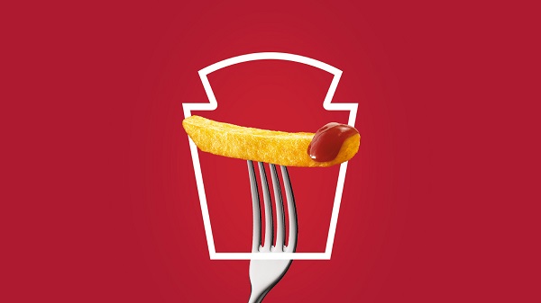
Image via JKR
Heinz has teamed up with creative agency Jones Knowles Ritchie (JKR) to create a uniformed branding for the first time in 150 years.
In order to ensure a “global masterbrand,” Heinz ended up having to tweak its logo, as well as its visual identity.
JKR decided to tap into the familiarity of the Heinz brand, and used it as a framing device to create playful visuals. The agency drew upon spaghetti hoops, plump tomatoes, and saucy beans in the new identity.
The new masterbrand entails a custom typeface, the ‘Heinz Label’, which mimics the flared sans-serif logo, ensuring that the brand embodies a consistent typographic visual language. A secondary typeface, ‘Intro’, offers a variety of styles including script and inline.
Heinz also has a new color palette of red, green, yellow, blue, and white.
The overall revamp aims to create brand unification and convey the message of “simple greatness.”
“We wanted to create brand unification across categories, geographies and brand experience touchpoints so that no matter how or where you experience Heinz, you’re able to celebrate its simple greatness,” said Jonny Spindler, managing director at JKR.
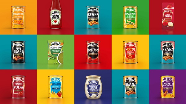
Image via Jones Knowles Ritchie (JKR)
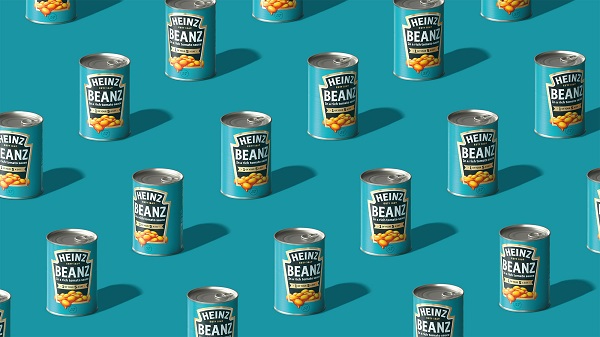
Image via Jones Knowles Ritchie (JKR)
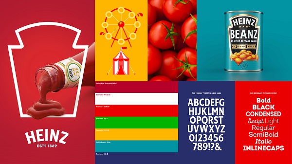
Image via JKR
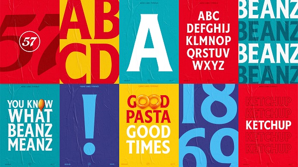
Image via JKR

Image via JKR
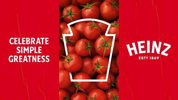
Image via JKR
[via It’s Nice That, opening image via JKR]
Also check out these recent news


