‘World’s Most Uncomfortable’ PANTONEs Convey Final Views Of Innocent Black Lives
Images by Jean Quarcoopome, Abdelrahman Galal, and Pranav Sabharwal, featured with permission
The world’s color standard PANTONE has a tradition of selecting a Color of the Year to sum up its promising vision for the forthcoming year and to offer a symbol of hope to everyone.
On the other side, there are PAIN TONES: color trends of unshakeable real-life events that aren’t as rosy. Described as an array of the “world’s most uncomfortable color tones,” the conceptual color guide showcases PANTONE colors drawn from the footage of killings of innocent Black men and women, with the youngest being 14-year-old Tamir Rice.
The gripping project was launched by Jean Quarcoopome, Art Director at Ghanaian creative agency Insel Communications; Abdelrahman Galal, an art director and graphic designer based in Hamburg, Germany; and Pranav Sabharwal, a copywriter based in Ontario, Canada.
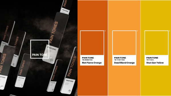
The trio selected hues from the final moments of innocent Black lives who died by the hands of unscrupulous law enforcers. They then identified the swatches from the PANTONE Matching System and gave the colors new, poignantly accurate PAIN TONE names like ‘Stun Gun Yellow’, ‘Brutality Blue’ and ‘Final Floyd Navy’.
“Each new name is an immortal reminder of the innocent Black men, women and children whose last living moments were colored by hate,” the creatives explained.
To complete the palette, the team reimagined PANTONE’s 2020 Color of the Year, Classic Blue, to be transparent “as a call to action for the world to choose to see through a person’s skin color.”
They then used plane-tracking AR technology to match the PAIN TONE colors against their real-world applications of police brutality clips, which you can view in the video down below.
“When it comes to others, the best way to see color is to see through it,” the campaign urges.
Explaining his experience working on the evidently wearying project, Quarcoopome describing, “I was haunted by every murder video I had to watch to find and rename the colors. But if my team and I hadn’t brought this project out into the world, I’d be haunted for the rest of my life.”
Nevertheless, he pressed on and emerged feeling renewed, later sharing with DesignTAXI, “Once the project was complete and out in the world, I started to feel good again, but I still needed some hope.”
PANTONE itself has taken a stand in the Black Lives Matter movement by propelling the fight for racial equality on its platforms and donating to charities focused on social justice and reform through a dedicated campaign.
However, as a brand with a unique position to represent people of color through its color knowledge, there’s more potential for PANTONE to funnel this power in a spectrum of ways.
In 2020, it’s time to depart from a world defined by a tone-deaf palette.
Featured with permission
PAIN TONE highlights. Images by Jean Quarcoopome, Abdelrahman Galal, and Pranav Sabharwal, featured with permission
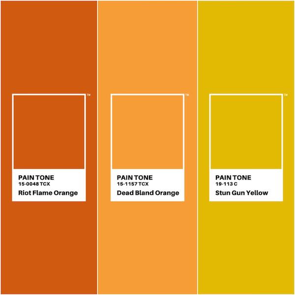
Warm PAIN TONES. Images by Jean Quarcoopome, Abdelrahman Galal, and Pranav Sabharwal, featured with permission
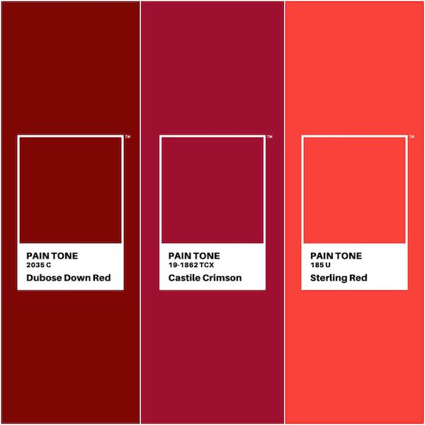
PAIN TONE reds. Images by Jean Quarcoopome, Abdelrahman Galal, and Pranav Sabharwal, featured with permission
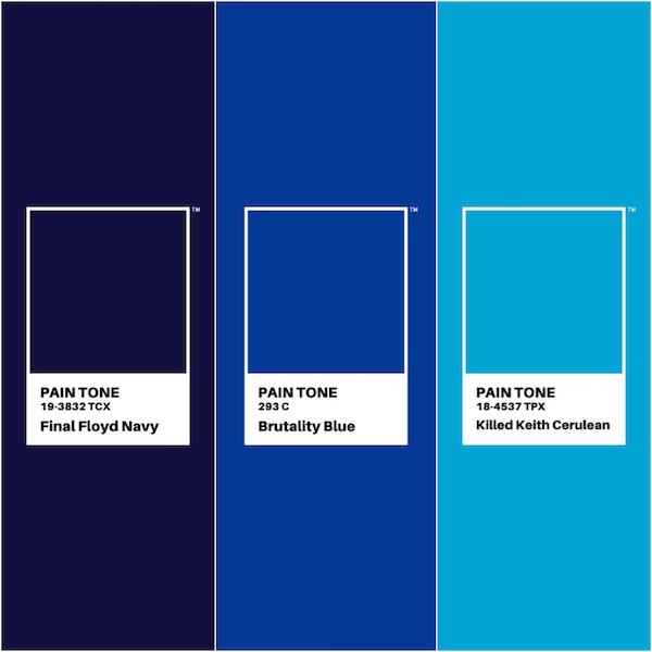
PAIN TONE blues. Images by Jean Quarcoopome, Abdelrahman Galal, and Pranav Sabharwal, featured with permission
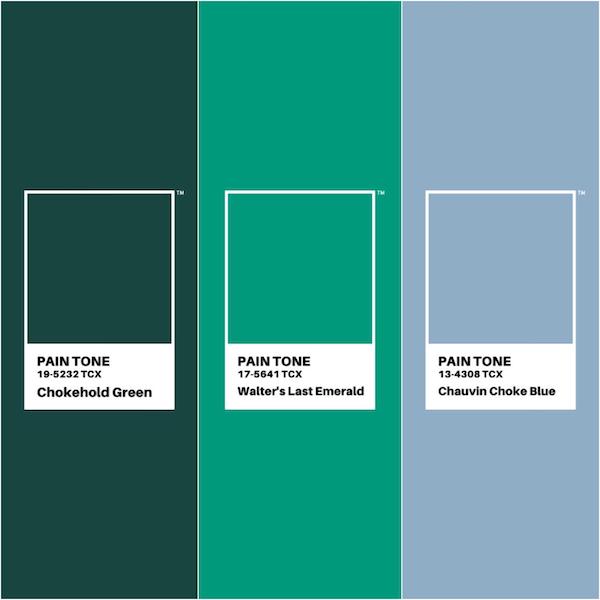
PAIN TONE greens with ‘Chauvin Choke Blue’. Images by Jean Quarcoopome, Abdelrahman Galal, and Pranav Sabharwal, featured with permission
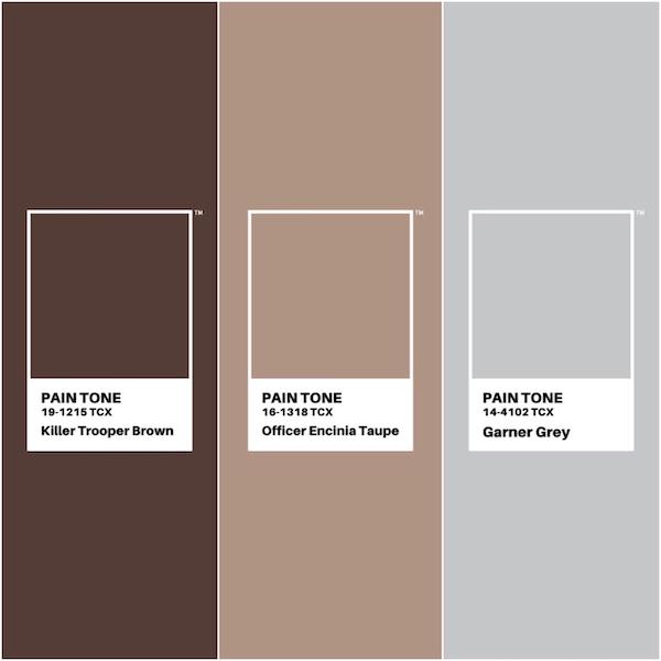
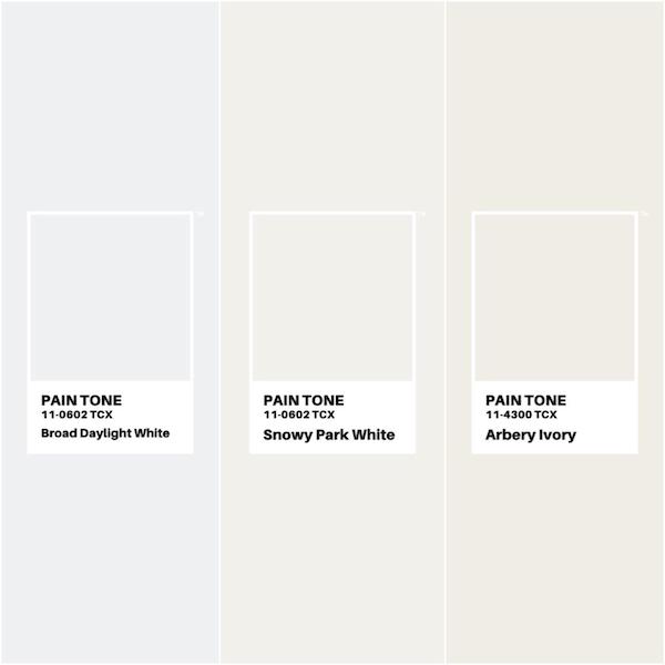
PAIN TONE neutrals. Images by Jean Quarcoopome, Abdelrahman Galal, and Pranav Sabharwal, featured with permission
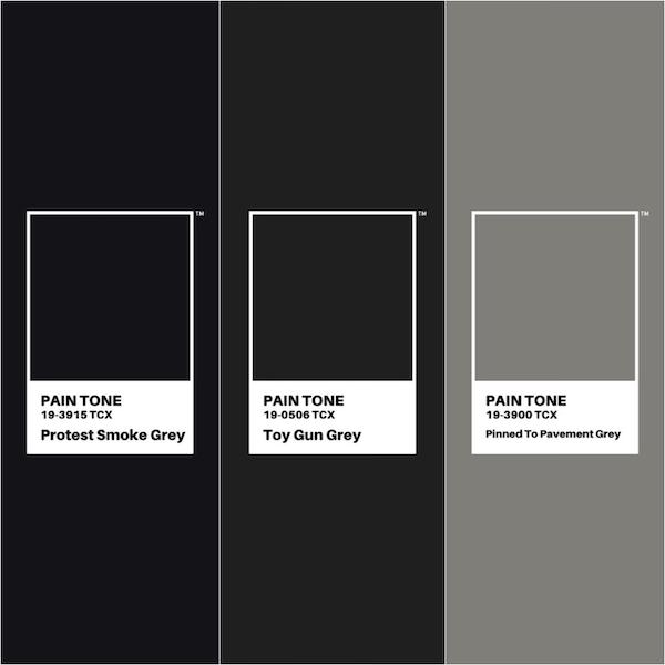
PAIN TONE shades. Images by Jean Quarcoopome, Abdelrahman Galal, and Pranav Sabharwal, featured with permission
[Images by Jean Quarcoopome, Abdelrahman Galal, and Pranav Sabharwal, featured with permission]
Also check out these recent news


