Subway Gives Its Cookies A Sweet Rebrand Harking Back To Nostalgic Retro Diners
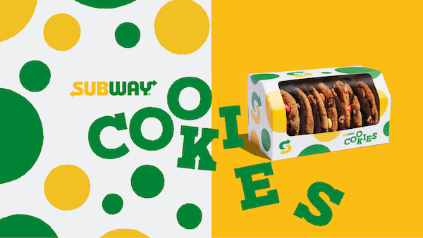
Image by Above+Beyond and featured with permission
Subway’s classic cookies have been given a makeover eliciting the nostalgia and joy you get after taking a bite out of the sweet treats.
The fun brand identity, designed by creative agency Above+Beyond for Subway locations in Europe, the Middle East, and Africa, features a typographic “COOKIES” logo-marque with a slab spin on the Subway typeface, giving off a “sweet, nostalgic, and comforting” appeal that reminds of 50s American diners.
With a little kooky touch, Above+Beyond has laid out the letterforms like “cookies on a tray,” pairing them with a subtle “baked” visual effect on the edges.
Apart from the whimsical logomark, the packaging now sports a pattern with polka dots of wholly different shapes, sizes, and edges, much like the unique form of each Subway cookie.
Of course, that famous green and yellow color palette is baked into the rebrand for consistency across 14 Subway markets.
“As the cookies have always been such a key part of a Subway guests’ experience, it was important to create an identity that was as memorable, and joyous, as the fast-food cult-classic itself,” explains Tom Munckton, Above+Beyond’s Creative Director of Design & Branding.
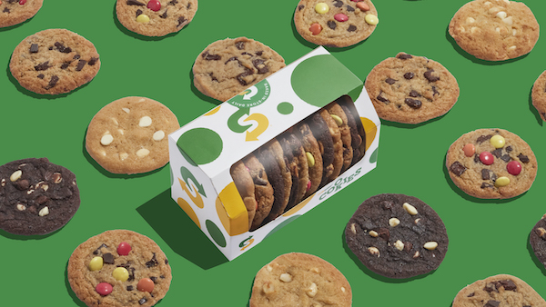
Image by Above+Beyond and featured with permission
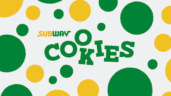
Image by Above+Beyond and featured with permission
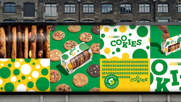
Image by Above+Beyond and featured with permission
Image by Above+Beyond and featured with permission
Video by Above+Beyond and featured with permission
Video by Above+Beyond and featured with permission
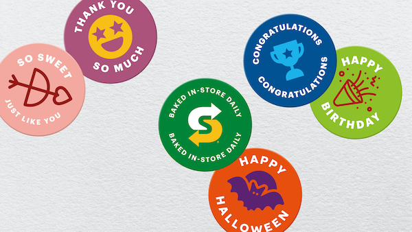
Image by Above+Beyond and featured with permission
[via Above+Beyond, images featured with permission]
Also check out these recent news


