James Cameron Finally Breaks Silence On That Dreaded ‘Avatar’ Logo
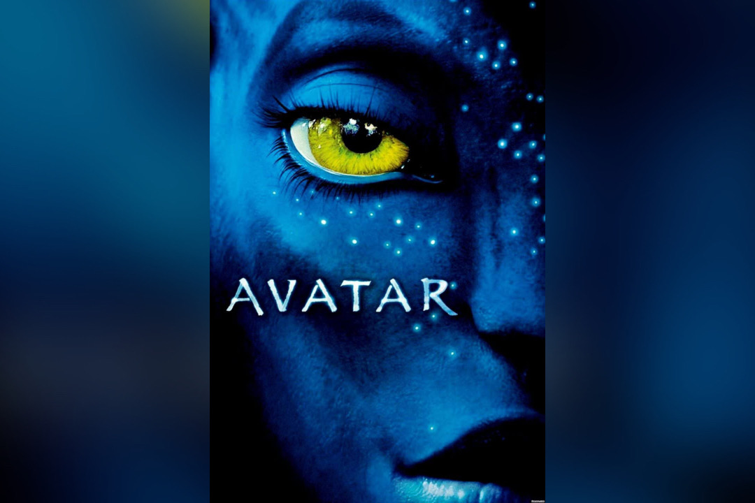
Image via IMDb
When Avatar hit the big screen in 2009, Instagram hadn’t even launched yet. Neither did anyone know what an iPad was. And Barack Obama had just stepped into office. It seems like eons ago when all those events took place. However, the James Cameron film left a mark that’s sustained even till today, thanks in part to its logo.
To be fair, people weren’t too bothered by the font until 2017, when Saturday Night Live dissected the movie’s painful use of Papyrus in a now-iconic sketch starring Ryan Gosling.
Gosling’s character was still deeply tormented by the font choice, even though it had been nearly a decade since Avatar’s release then. In the skit, he wondered aloud if the designer simply clicked open a dropdown menu and “randomly selected” Papyrus. “This man, this professional graphic designer. Was it laziness? Was it cruelty?” he pondered. Now, no one can ignore those intrusive thoughts whenever the Avatar title shows up.
Although nobody in the film crew has credited the SNL feature, they were likely motivated by the backlash to give the branding a do-over for the sequel, Avatar: The Way of Water.
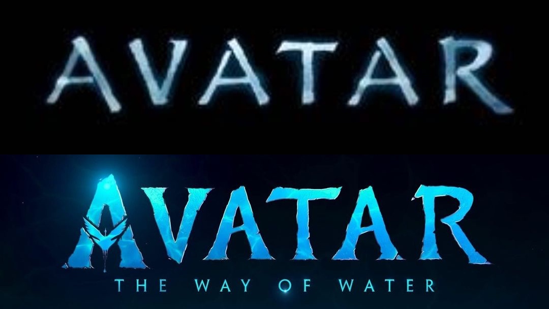
Old logo (above) VS new logo (below). Images via IMDb and Avatar
The follow-up logomark uses a bespoke typeface to avoid opening another can of worms, without departing too much from the look and feel of its predecessor.
Now, for the first time ever, Cameron has opened up about the backlash surrounding the Papyrus-heavy title that audiences loved to hate. In an interview published in the January 2023 issue of Empire magazine (via Slash Film), Avatar’s director joked that the first film could have raked in more money if it wasn’t “for that damn font.”
Cameron added that he didn’t know the font was designed outside the studio—he’d always thought it was created by the art department or title company. And while the final work was ripped apart by the public as “lazy,” the director admitted to still liking it.
Cameron also took a few jabs at Gosling’s SNL portrayal for his dramatic reaction to the logo, asserting that the actor “needs to get out more” if he’s this frantic over a font. “Time to move out of your mom’s basement, Ryan!” the director teased.
On a more serious note, Cameron said the conversation about Papyrus’s Indigenous nuances speak to the themes in Avatar, so he’s not too mad about the way things have panned out.
In a separate interview with Entertainment Weekly, producer Jon Landau said it was amusing how a simple font drummed up so much chatter. Though, he pointed out that when it was confirmed the Avatar plot would be extended, filmmakers felt it was high time to introduce an original typeface, called ‘Toruk’, to represent the Avatar franchise and for the public to use.
To Landau, the unrelenting fuss over the font illustrates the cultural impact Avatar has left.
Avatar: The Way of Water arrives in theaters on December 16, 2022.
[via BGR and Slash Film, images via various sources]


