
Mirinda Unveils New Visual Identity Reflecting Boldness & Vibrancy Of Creatives

Fruit-flavored carbonated drink Mirinda has debuted its brand-new global platform—There’s No Flavor Like Your Flavor—alongside a revamped visual identity, both of which are highlighting the creativity found across generations.
Now, as the brand transitions to reflecting the spark of inspiration Gen Z creatives are craving, it’s putting boldness at the forefront of its ethos, celebrating vibrant creators that share authentic work both online and in real life.
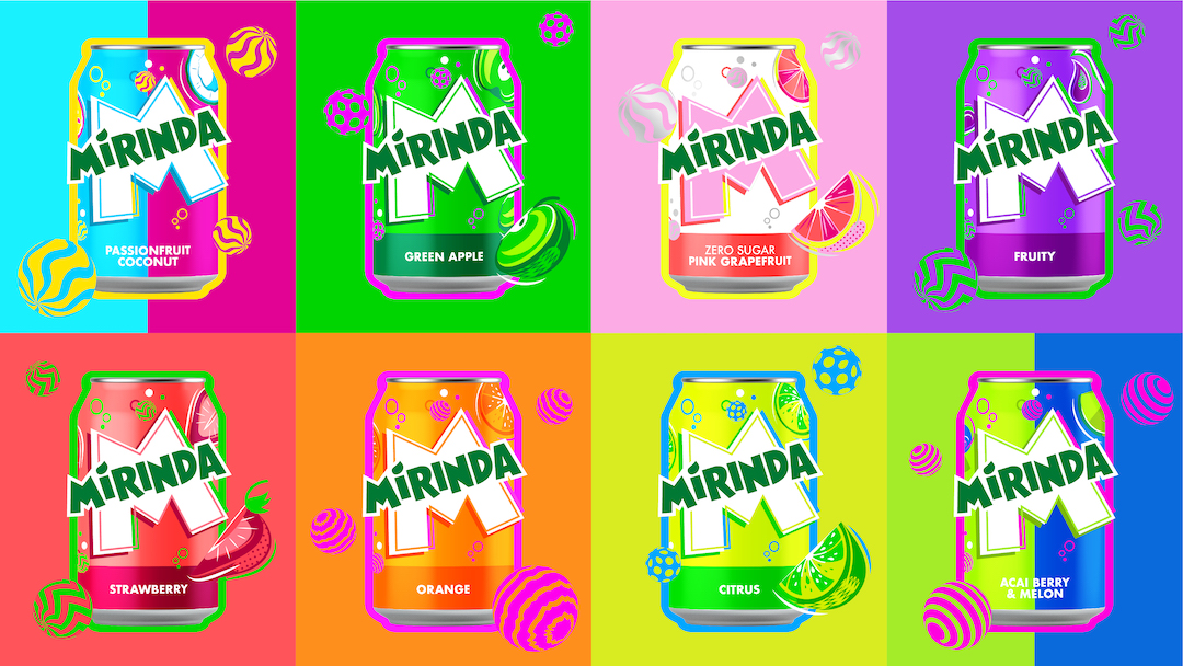
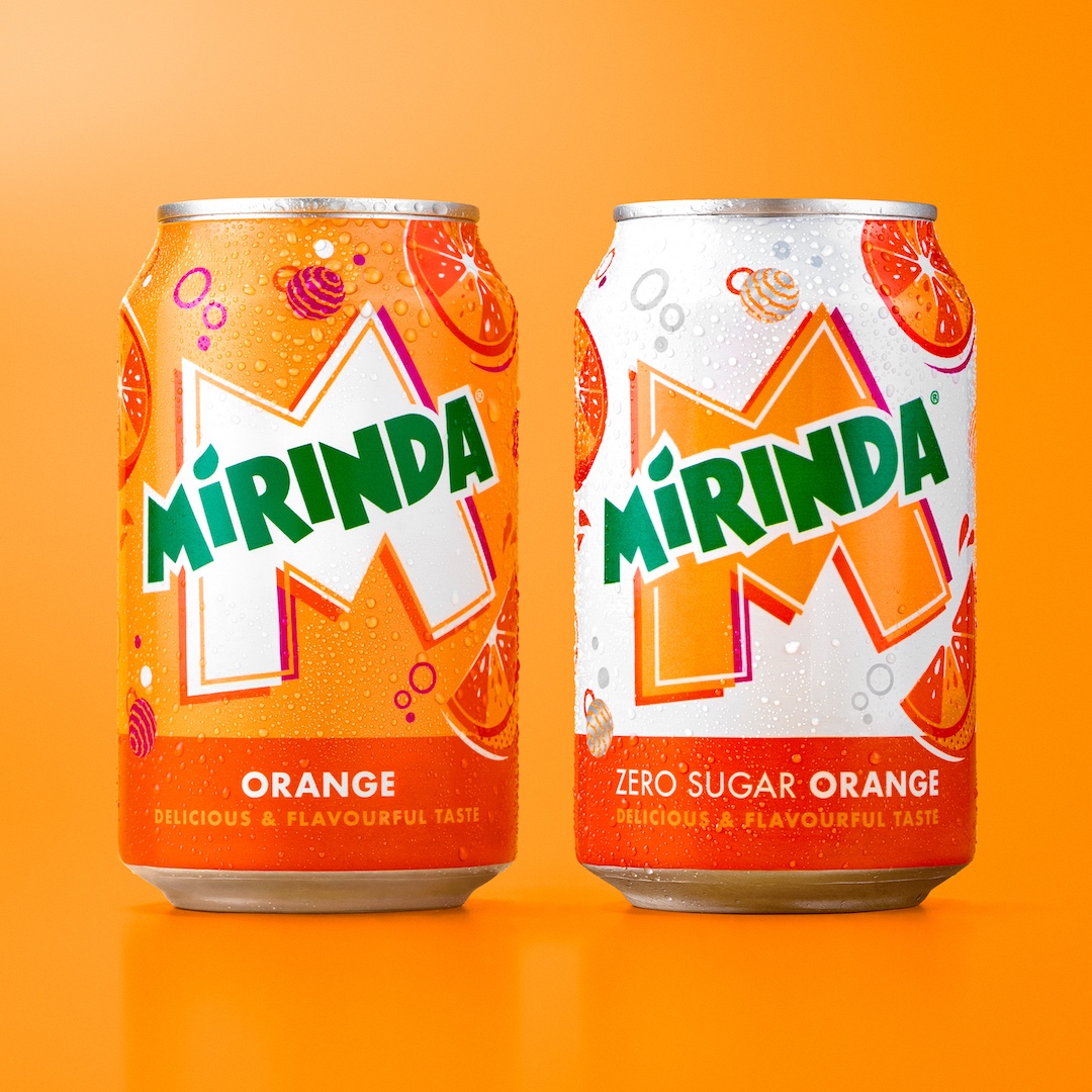
To mark the launch of the platform, Mirinda is unveiling ‘Making an M-Pact’, an updated look developed by the PepsiCo Design and Innovation team. Its iconic logo has been refreshed with a brighter green, sharper corners, and cleaner lines to make it even more noticeable.
The signature ‘M’ motif will serve as a canvas in which the brand expresses its own creative juices, bringing about a refreshing and playful aesthetic with twirling spheres, fizzing bubbles, and zesty fruit illustrations throughout.
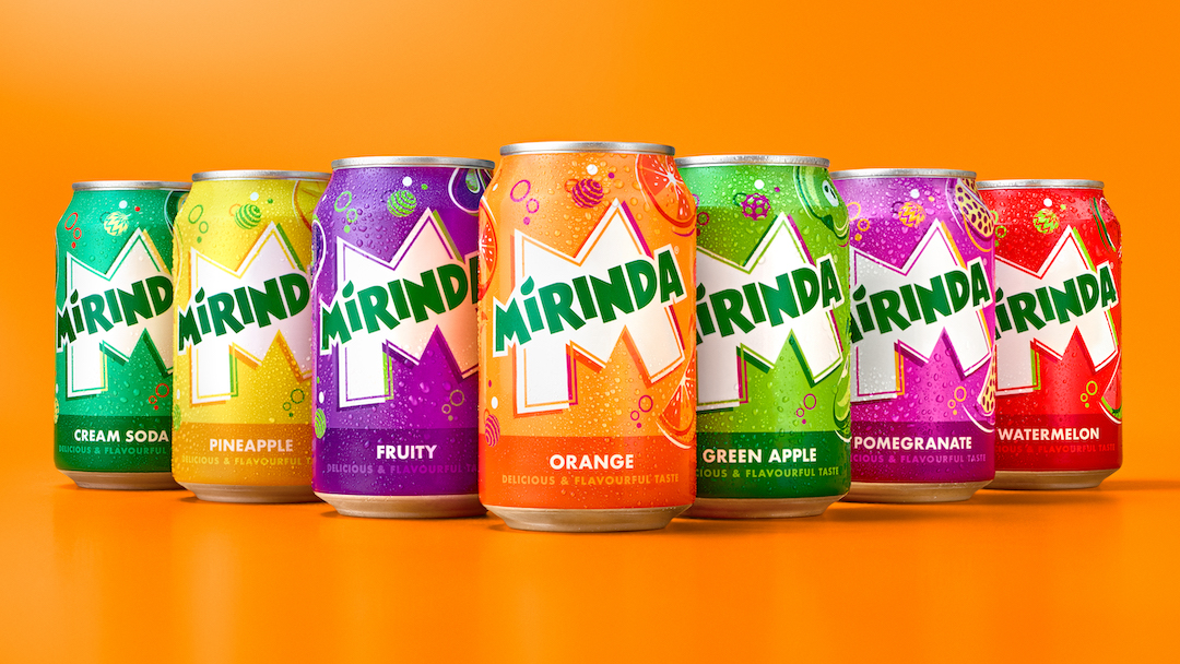
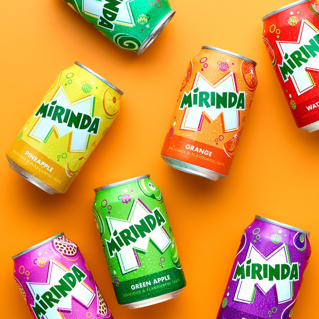
Each of the line’s 50+ fruit flavors will be given its own corresponding color palette, with vivid, contrasting colorways to show how they’re tailored to the unique palates of regions around the world—such as Acai Berry in Poland and Green Cream Soda & Orange Tamarind in Vietnam.
The updated visual identity will be rolled out across 20 international markets, with details on the cans tweaked to match their respective native languages. This new look will also appear on the brand’s merchandise, advertisements, retail displays, digital media, and more.

“Mirinda’s 50+ flavors are a treat for the senses, and we wanted the brand’s visual identity to look and feel the same. PepsiCo Design and Innovation brought Mirinda to life with vibrant, contrasting colors and bespoke illustrations that create a sense of dynamic energy and playfulness,” said Mauro Porcini, Chief Design Officer at PepsiCo.
“We know Mirinda fans engage with the brand digitally as much as they do physically, so we created a visual identity that retains its excitement and distinction across all platforms.”

[via PepsiCo, images courtesy]


