Johnson & Johnson Irons Out The Cursive From Its Logo After 135 Years

Image via Johnson & Johnson
Johnson & Johnson’s all-too-familiar script logo, once described by the pharma giant as “one of the longest-used company emblems in the world,” has been smoothed out. And no, none of that moisturizing baby lotion was involved in the process.
The overhaul marks a dramatic pivot in the company’s direction. It replaces the cursive wordmark that has been in use since 1887, which is based on the handwritten signature of co-founder James Wood Johnson. The revamp signifies Johnson & Johnson’s splitting into two companies. The first, retaining the J&J name, will focus on pharmaceuticals and medical devices; while the second will serve as an umbrella for consumer products, under the new name Kenvue.
The new Johnson & Johnson logo retains a connection to its heritage and warmth while embracing a contemporary twist and encapsulating healthcare innovation in an inclusive way.
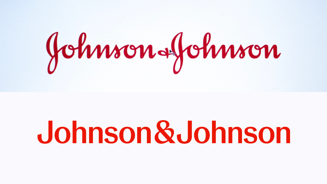
Johnson & Johnson’s logo, before (above) and after (below). Images via 212566635 © Cristian Storto | Dreamstime.com and Johnson & Johnson
Crafted in a single pen stroke, each character exudes a sense of both “unexpectedness and humanity.” This logomark, now available in both long and short forms, includes a more personable ‘J&J’ variant that is particularly suited for the digital age.
Johnson & Johnson is keeping red as its brand hue to denote its long-standing ability to respond urgently to healthcare challenges. At the same time, the shade has been refreshed with more vibrancy to signify its readiness to evolve with the times.
Notably, the previously overlooked ampersand has emerged as arguably the most pronounced feature, growing to the same height as the two J’s. Reimagined to be more globally recognizable, the symbol speaks of the brand’s open and interconnected nature, and its instinct to foster connections through a caring, human touch.

Image via Johnson & Johnson
Beyond the logo, Johnson & Johnson’s new identity extends to its art direction. Through illustrations, photography, and more, the company seeks to spark energy, optimism, and inclusivity. This distinctive approach in healthcare branding reflects a commitment to a brighter, more hopeful future.

Image via Johnson & Johnson
For now, the classic script logo will still be stamped across products from the likes of Band-Aid and Clean & Clear. However, Johnson & Johnson intends to phase it out completely to make way for its next well-defined chapter.
[via CNN and Associated Press, images via various sources]
This article was crafted with assistance from an AI engine, and has been manually reviewed & edited.


