Herman Miller Unveils Brand Refresh To Kick Off 2024 On A Vibrant Note
Images via Herman Miller
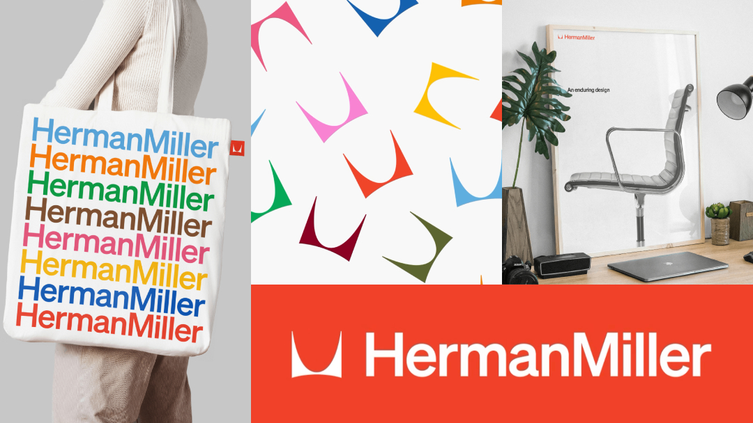
Herman Miller is finding its seat in a new era with the birth of a fresh brand identity. “New year, new look,” the furniture design titan proclaims as it collaborates with New York branding studio Order to introduce a revised logo, a vivid color palette, and a renewed commitment to the fusion of beauty and utility—ensuring its designs continue to be both aesthetically pleasing and supremely functional.
The overhaul sees the iconic ‘M’ logo, originally crafted by Irving Harper in 1946, playing a “starring role.” It’s complemented by a wordmark set in Söhne from Klim Type Foundry, reflecting a modern yet timeless aesthetic. This new identity encapsulates Herman Miller’s philosophy that beauty should always walk hand in hand with practicality, a principle that has guided its design ethos for decades.
View this post on Instagram
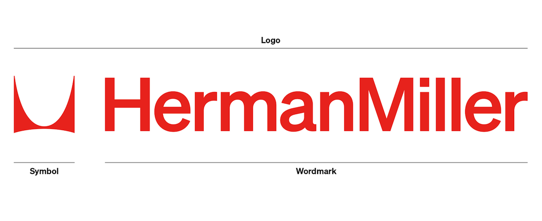
Image via Herman Miller
Beyond a visual facelift, the brand evolution reinforces Herman Miller’s core values. The company prides itself on its dual nature—balancing curiosity with informed decisions, generosity with rigor, and expressiveness with honesty. It remains committed to creating objects that are not only original and influential but also feel inevitable and timeless, in partnership with leading designers.
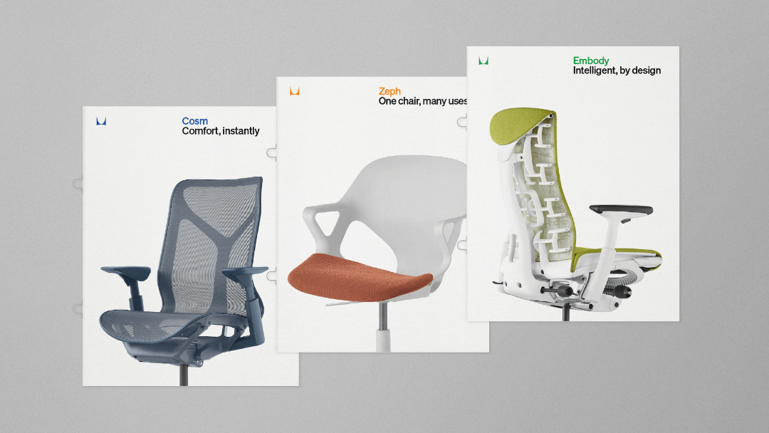
Image via Herman Miller
Color has always been a significant player in Herman Miller’s visual narrative. The new palette is an expansion of this vivid history, now including a broader spectrum of hues, from blues and grays to pinks, greens, and oranges. This selection aims to balance information with expression, carrying forward Herman Miller’s rich legacy in color use.

Image via Herman Miller

Image via Herman Miller
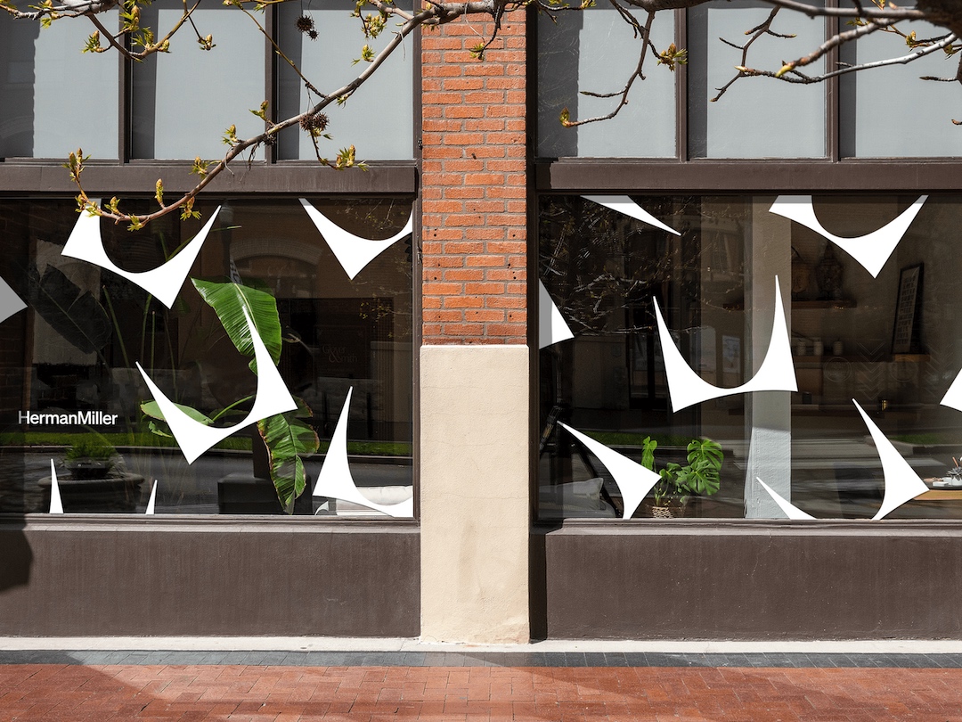
Image via Herman Miller
While the fundamental ‘M’ remains a steadfast symbol of the brand, the surrounding elements, including the typography and color scheme, have evolved. The Söhne type family—a marriage of “Akzidenz-Grotesk meets Helvetica”—now represents the brand’s primary typeface, chosen for its capacity to blend historical significance with modern relevance.

Image via Herman Miller
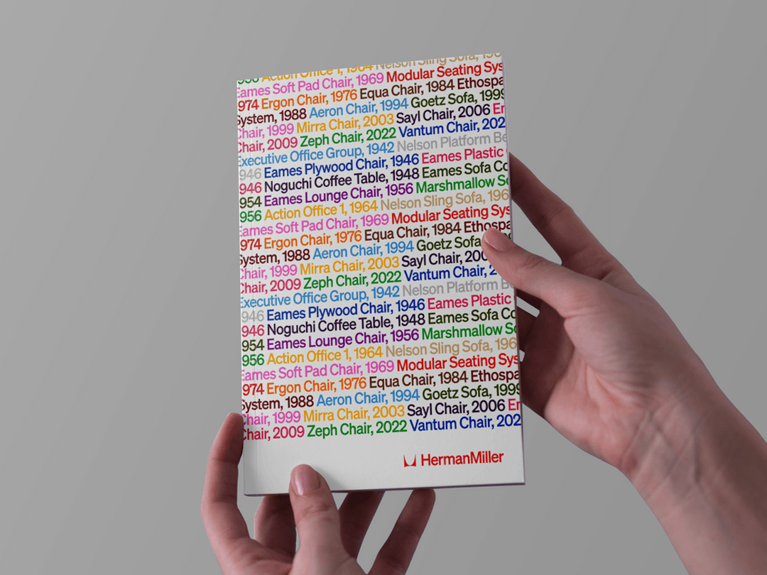
Image via Herman Miller
Söhne Kräftig, the primary voice of Herman Miller, is complemented by Söhne Halbfett and Söhne Buch to ensure versatility and legibility across various scales and applications.
Image via Herman Miller
Image via Herman Miller
All these elements, new and old, now gather in an all-new set of brand standards compiled by the furnishing brand and the branding firm.
Image via Herman Miller
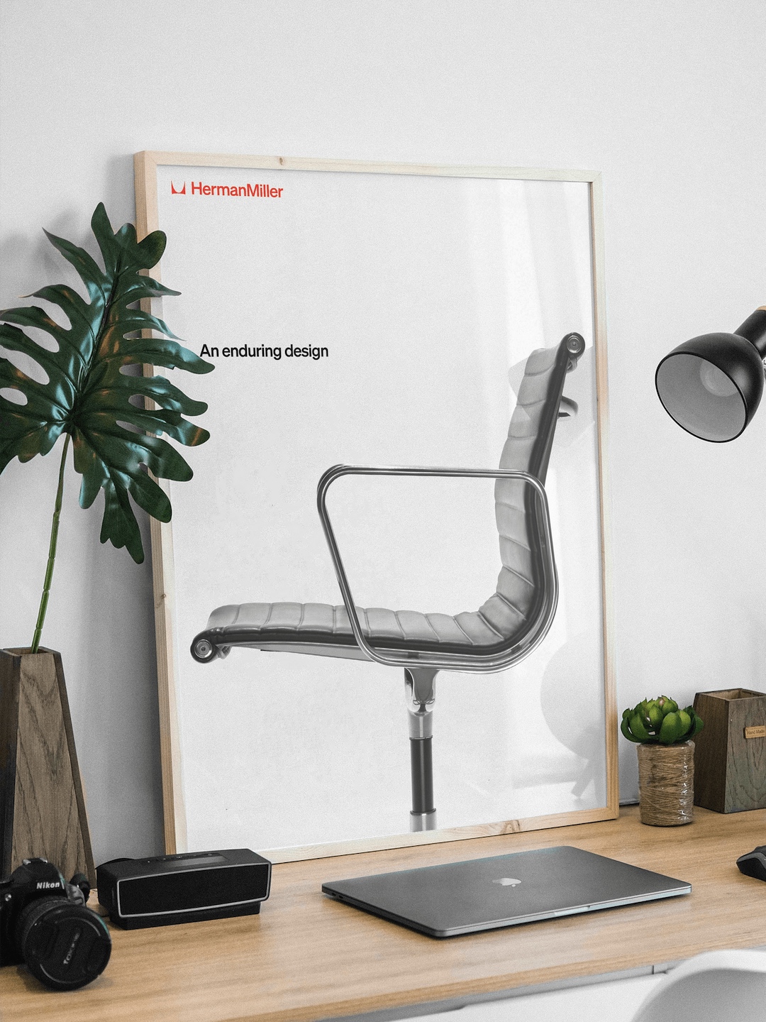
Image via Herman Miller
As the year progresses, expect to see Herman Miller’s new visual identity come to life across its products and communications.
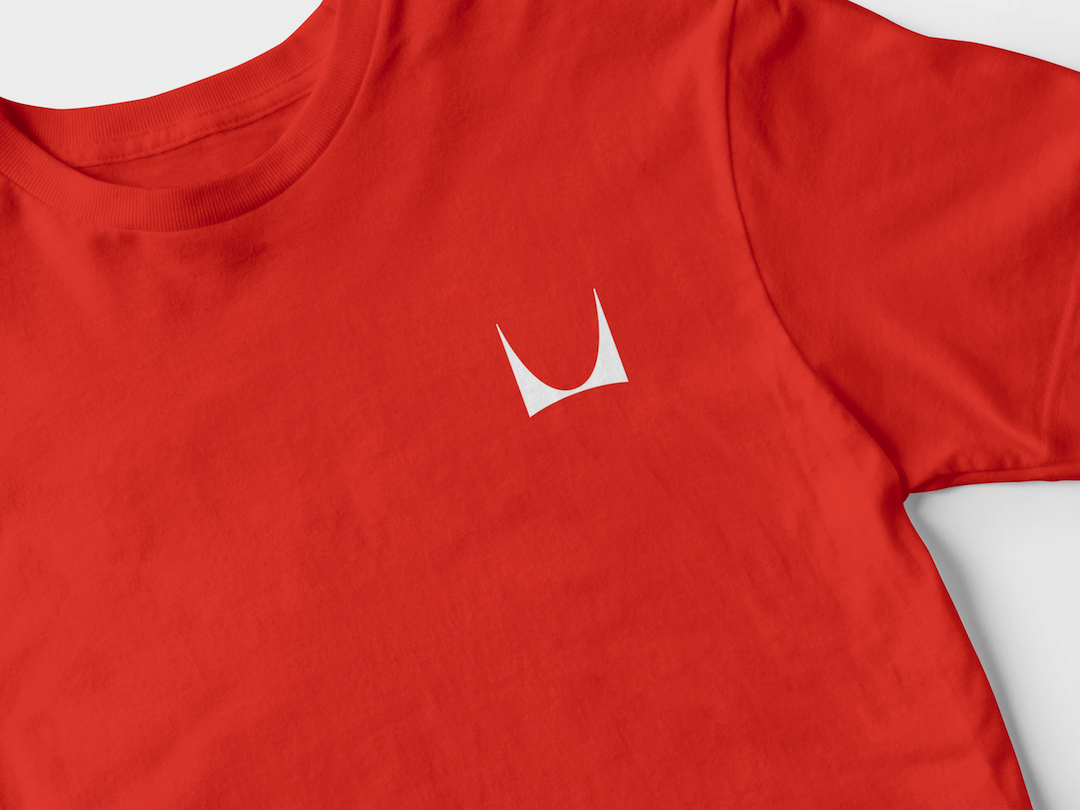
Image via Herman Miller

Image via Herman Miller
[via Herman Miller]


