Pepsi Spotlights Coca-Cola Cans, Only To Pop The Rival’s Superiority Bubble
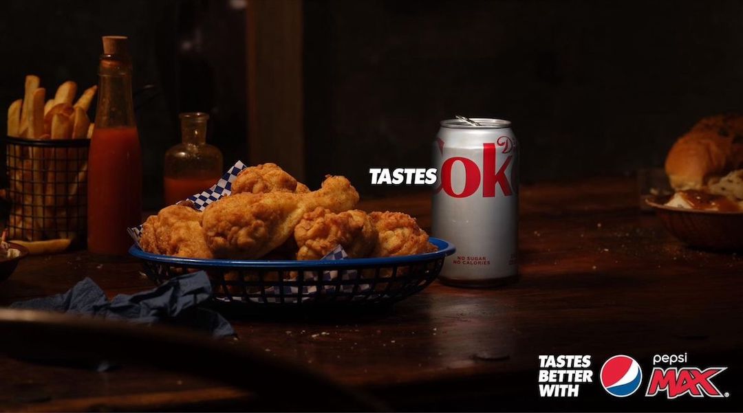
Image via Vandita Pandey / PepsiCo Australia and New Zealand
The Coca-Cola and Pepsi rivalry go a long way, but camp blue finally has an argument that makes the red look flat. Tastes OK, its latest campaign, takes a tongue-in-cheek approach to reveal that Coke’s weakness has been in its name and branding all along.
Pepsi Max in Australia is zeroing in on the “OK” part of the competitor’s name to make a clarion call to drinkers everywhere that settling for just that, OK, would be an injustice to the taste buds. New visuals concocted by the creative agency Special show the Coca-Cola can placed next to fast-food favorites like burgers and chicken wings; the twist is that only the letters ‘O’ and ‘K’ are in view, sneakily accentuating Pepsi Max’s flavor profile as the superior of the two and the categorical hero of mealtimes.
Creative directors Simon Gibson and Nils Eberhardt from Special have shared their mix of excitement and trepidation in working on this effervescent jab, an extension of Pepsi Max’s Tastes Better initiative.
“It’s such a bold and direct line and it’s led to great work in the past, so we all knew we needed to do something that lived up to it,” the pair shared in a press release.
Never Settle for OK - Pepsi Max Campaign Makes Clever Use of 'Coke' Name | Branding in Asia https://t.co/ALFt9dRtWB
— Branding in Asia (@BrandingInAsia) February 5, 2024
The inspiration, as it turns out, came from an unexpected source—an image released by Coca-Cola itself. As it is often said, keep your friends close, but your rivals closer.
By framing the choice between Pepsi Max and Coca-Cola as one between yielding to just “OK” and opting for max-imum flavor, the activation floats up to the consciousness as the ultimate choice in terms of quality.
[via Campaign Brief, Mediaweek, Mumbrella, Branding in Asia, images via various sources]


