Sears Reveals Second Logo Update In A Year, But Internet Users Aren’t Impressed
Sears’ logo gets another update just nine months after its initial rebrand.
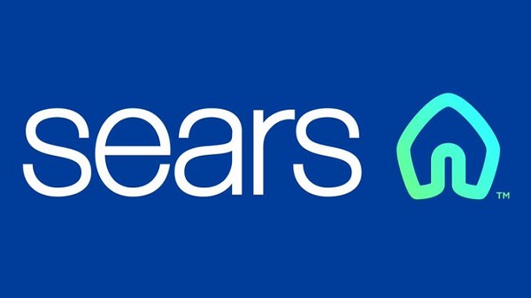
While the previous redesign was deemed controversial as many couldn’t decide if it looked like a candle, igloo, or the Airbnb logo, Sears decided to tweak the symbol instead of scraping the whole thing.
Currently, the new logo is less messy, but many are still wondering what the logo resembles.
According to a survey by Creative Bloq, 79-percent preferred Sears’ first logo to the redesigned one in 2019. Therefore, it will be hard to tell if the second revamp will fare better, as it only shows slight changes.
The final change received many negative comments from social media users. Over at Under Consideration, JustJoeDesign said, “It looks like a home a troll would live in.” Another reader brutally said, “This a good representation of Sears right now. Undecided, outdated and extremely lame.”
Noted: New Logo for Sears (Again) pic.twitter.com/36wIy0UrKX
— Hudgens News (@Hudgenews) February 12, 2020
So @Sears is changing their logo from a butt to a vagina, or a gaping butt depending how you look at it? #choicesweremade pic.twitter.com/n1J9dSGSEN
— In Pants Productions (@inpantspro) February 13, 2020
whoever designed sears new logo needs to lose their job asap pic.twitter.com/PBoYDzYEYm
— 𝕸𝖆𝖉𝖎 (@hawtsock) February 13, 2020
[via Creative Bloq, opening image via Facebook]
Also check out these recent news


