Coca-Cola Rolls Out New Minimalist Redesign Globally, Stripping Back Clutter
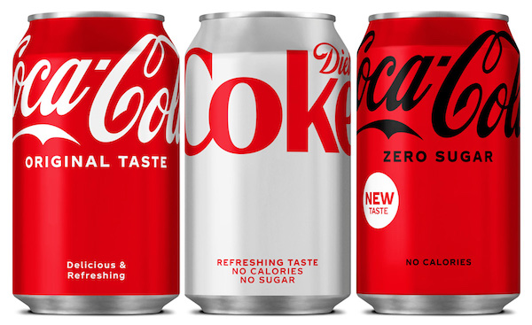
Image via Coca-Cola European Partners
For the first time since 2016, Coca-Cola has unveiled a new global packaging update. This change is the first redesign since the company instituted its ‘One Brand’ strategy, which saw a unified look across the range.
The new look, designed by Coca-Cola’s in-house team based in Atlanta, is a more minimalist take on the brand’s iconic look. “Added elements” from the cans have been removed, including the red disc and wave line that featured in previous designs.
According to Design Week, Coca-Cola said the rebranding effort was “to provide a simple and intuitive navigation system that carries across all Coca-Cola variants.” The design process started with the new packaging for Coca-Cola Zero, which was driven by what the company calls the “universally-recognized” Coca-Cola red.
To distinguish between the different drinks, the brand’s signature color pairings remain: white type on red for the original Cola-Cola, black type on red for Coca-Cola Zero, and red type on silver for Diet Coke.
The empty space at the bottom of the cans is part of a “visual metaphor,” Coca-Cola said. Having the Coca-Cola logo at the top of the can is also an indication the drinks are “uplifting.”
The new design for Coca-Cola Zero has already launched in Europe and Latin America. The rest of the redesign will be rolled out globally, and all variants are expected to don the new designs by 2022.
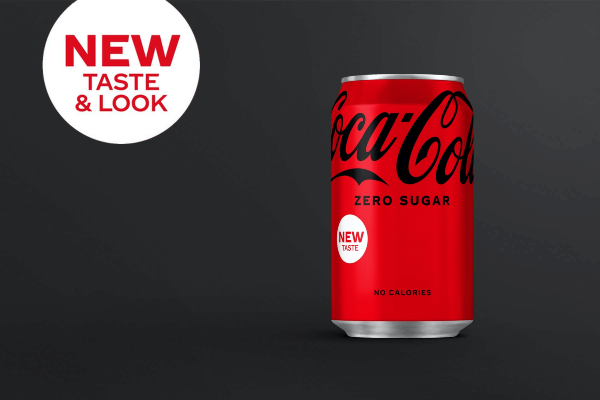
Image via Coca-Cola UK
[via Design Week, cover image via Coca-Cola European Partners]
Also check out these recent news


